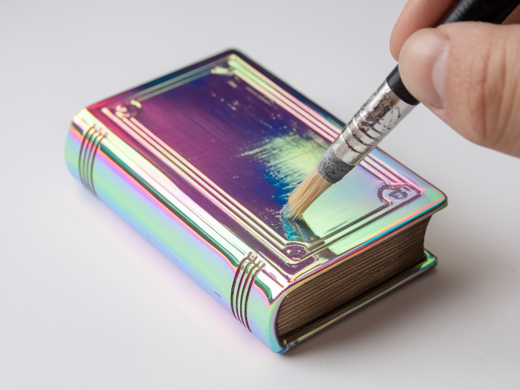
I love tiny things that feel like they hold secrets — miniature books are one of my favourite props for dioramas, still lifes and stop-motion setups. One detail that instantly makes a small book feel like it belongs to another world is an iridescent cover: that shimmery, shifting colour that seems to change as you move. In this tutorial I’ll show you how I paint convincing iridescent book covers using an interference medium and a little dry‑brushing. The technique is forgiving, inexpensive and works beautifully at small scale.
Why interference medium?
Interference mediums (also called interference or iridescent mediums) are acrylic additives or paints that contain microscopic mica particles coated with titanium dioxide. They reflect light in a way that produces colour shifts depending on the viewing angle and the base colour underneath. I like them because they give a subtle, layered shimmer that reads as believable iridescence even on tiny surfaces. Compared with pearlescent pigments or flakes, interference mediums are easy to apply with brushes and combine well with traditional paint layers.
What you’ll need
Here’s a concise list of materials I use — many of these are very affordable and easy to source:
Preparing the little covers
Surface preparation matters, especially at small scale. If your covers are raw board or rough paper, I lightly sand them with 600–1000 grit to remove tooth and create a smooth surface. Dust off the particles with a soft brush or cloth. If the board is very absorbent, I apply a thin coat of acrylic gesso or a neutral acrylic like titanium white thinned with water to seal it. Let that dry completely.
If you want very crisp edges (for a painted spine or foil-like panels), mask off those areas with low-tack tape before you paint.
Choosing your base colour
Base colour is crucial because interference mediums act like a veil — the colour below shows through and interacts with the iridescence. For deep, jewel-like shifts I usually work with a dark base: Payne’s grey, deep navy, or a mix of ultramarine with a touch of black. For warmer shifts choose deep brown, bronze or maroon. You can test on spare scraps: drop a bit of interference medium over different bases to see which combination sings.
Tip: don’t make the base glossy. A matte or satin base gives the interference medium a better surface to reflect from. If the base is too shiny, the reflection can look flat.
Painting the base layer
Using a small flat brush, paint an even, thin coat of your chosen base colour. For miniature covers I prefer thin layers so the paint dries evenly without pooling. If the board is absorbent, two thin coats are better than one thick coat. Allow each coat to dry fully.
Applying the interference medium
Now for the exciting bit. There are two common approaches I use depending on how dramatic I want the iridescence to be:
Apply with a soft round brush in thin, even strokes. Work quickly and avoid over‑brushing, which can create streaks. If the medium is concentrated and you want a subtler effect, wipe a little off on a paper towel and lay down a thinner veil. Let this layer dry completely — interference mediums dry fairly quickly but may remain tacky longer if thick.
Building depth with layers
I build depth by alternately glazing with interference and adding tiny accents of opaque colour. Here’s a sequence I often use:
Because the shimmer changes with angle, layering helps create a living surface that reads as iridescent from multiple viewpoints.
Dry‑brushing technique for highlights and texture
Dry‑brushing is a small-scale magician’s trick: it adds the suggestion of edgewear, embossing or metallic highlights without needing foil. Load a stiff brush with a small amount of paint (metallic bronze, warm gold or a lighter tone of your base), then wipe most of it off on a paper towel so the brush is almost dry. Lightly drag the brush across edges, corners and textured areas. This catches the highest points and reads as worn metallic highlights on a book cover. On tiny covers, less is more — a whisper of highlight often reads better than a bold stripe.
Adding faux tooling and small details
For miniature tooling, I use a very fine liner brush or even a sharpened toothpick. Metallic paints (Golden, Winsor & Newton Galeria, or the inexpensive FolkArt metallics) work well. Paint tiny corner flourishes, a central emblem, or scoring lines along the spine. If you want a debossed look, paint a slightly darker narrow line next to the metallic highlight to suggest shadow.
Sealing and finishing touches
When you’re happy, protect the surface with a thin coat of satin varnish. I avoid high-gloss unless I want the book to look like it has a laminate cover. If you varnish, test that it doesn’t dull the interference effect (some varnishes can slightly change sheen). A spray varnish applied in light passes is the easiest for a smooth finish, but water-based brush-on varnish is fine for small pieces.
Common problems and quick fixes
Quick tests and why they matter
I always keep a scrap of the same board as my test strip. It’s how I check base/interference combos, varnish behaviour and drying times. Tiny experiments save larger mistakes — try different base colours and layering sequences on scraps until you have a combo you love.
Final notes on scale and storytelling
At miniature scale, suggestion is everything. You don’t need perfect mirror‑like iridescence — you want the hint of shifting colour that reads convincingly from a few inches away. Think about the story: is this a well-loved, slightly scuffed spellbook or a pristine collector’s edition? Your choices in base tone, dry‑brushing intensity and tooling will tell that story. For me, the magic happens when a small painted book, held in hand or peeking from a shelf, makes someone pause and imagine what might be inside.