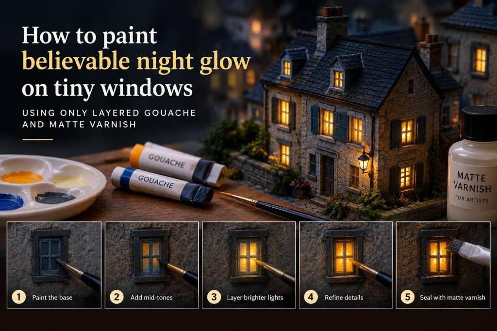
When I paint tiny windows, I am not trying to make them look bright. I am trying to make them feel alive. A believable night glow is rarely a flat yellow rectangle in a dark wall. It is softer, deeper, and a little uneven, as if someone has just moved through a room with a lamp, or left a small light burning near a curtain. I return to this effect again and again in miniature houses, paper scenes, small sculptural facades, and illustrated props because it adds instant atmosphere without needing complicated materials. For me, layered gouache and matte varnish are enough to create that quiet illusion.
What makes night glow look convincing
The secret is not brightness alone. A convincing glow depends on contrast, temperature, and restraint. If every window is equally luminous, nothing feels real. In actual nighttime scenes, light leaks unevenly through glass, gathers in corners, and softens as it meets surrounding darkness. I think about this as a small performance between paint layers: one layer establishes the dark world, another suggests the lit interior, and a final layer quiets the surface so the glow feels embedded rather than pasted on.
I also like to remember that tiny windows do not need detailed interiors to read as believable. A suggestion is often stronger than a description. A faint warm block, a vertical line, a dim shape of a curtain, or a slightly brighter patch near a lower edge can say more than a little room full of tiny furniture. When I keep the marks simple, the viewer’s eye finishes the story.
Materials I reach for
I keep the material list intentionally modest. Gouache is ideal because it dries matte, layers beautifully, and can be adjusted with water while still keeping a soft opacity. Matte varnish helps unify the final surface and gives the glow a more believable finish than anything glossy would. I usually work with a small brush, a mixing palette, clean water, and a scrap of paper or board for testing values before I commit to the miniature itself.
For color, I tend to use a restrained range:
- Warm yellow ochre for a gentle interior light
- Cadmium yellow pale or a similar soft yellow for brighter centers
- Raw umber or burnt umber for shadowed interior shapes
- Ultramarine or Payne’s gray for the night exterior
- A touch of white for lifting the glow without turning it chalky
I avoid very pure white for most of the glow. It can make a miniature window look lit by a spotlight instead of a room. A softened cream, a pale amber, or even a slightly dirty yellow feels much more natural.
Building a dark surface without losing detail
I start by painting the surrounding wall or facade in a deep, matte night tone. I do not want a dead black unless the scene truly needs it. Dark blue, charcoal, indigo, and umber mixtures often feel richer. A pure black surface can flatten the image, while a dark mix with slight variation gives the window more presence. I apply this first layer evenly, then leave it alone until it is fully dry.
After that, I decide where the light source lives. I imagine the room behind the window rather than the window itself. Is the light near the left side? Is it coming from above, as if from a ceiling lamp? Is it blocked by a curtain or furniture? Even if none of that is drawn in detail, thinking this way keeps the glow believable. I sketch the lit area very lightly if needed, then place a warm base color inside the window opening.
This first interior layer is usually broader and softer than I want the final result to be. I let it extend a little toward the edges, because real light does not stop abruptly. If the window is tiny enough, I sometimes use the tip of a dry brush or a fine pointed brush with almost no water, which keeps the pigment controlled and prevents flooding the frame.
Layering gouache for a soft inner light
Once the base is dry, I begin building the glow in layers. This is where gouache shines. I work from the inside out: a warmer, brighter center, then slightly darker edges, then a subtle adjustment to the frame if needed. The goal is not a strong painted circle of light. I want a quiet sense that brightness is sitting behind the glass and passing through it.
I often use three passes. First, I place a pale warm tone in the center of the window. Second, I deepen one side with a slightly darker amber or umber mix, which creates a suggestion of depth inside the room. Third, I touch the lower edge or one corner with a slightly brighter highlight to mimic the way indoor light gathers or reflects off glass. These shifts are small, but they matter.
When I paint several tiny windows in one facade, I vary them deliberately. One might look fully awake, another half-lit, and another nearly dark with only a faint edge of warmth. That uneven rhythm makes the whole building feel inhabited. A row of identical lights can feel decorative, while a row with small differences feels lived in.
Using matte varnish to calm the surface
Matte varnish is the finishing move that helps the illusion settle into place. Before varnishing, gouache can sometimes look a little powdery or overly fresh, especially in bright interior tones. Once I apply a thin matte coat, the surface becomes more cohesive. The colors lose any distracting chalkiness, and the glow reads as part of the object rather than paint sitting on top of it.
I always test varnish on a spare sample first, because different brands can shift color slightly. Some deep tones become richer, some pale tones sink a little, and some whites warm up in a pleasing way. I usually prefer a spray varnish for very small scenes, applied in light passes rather than one heavy coat. A heavy coat can disturb delicate gouache layers or create unwanted pooling near tiny details.
My favorite effect is the moment when the varnish dries and the window suddenly feels more convincing. The shine disappears, but the light seems to settle inward. It becomes less like paint and more like a small source of heat inside darkness.
Common problems and what I do instead
One of the most common issues is over-brightening. When a window looks too luminous, it can dominate the entire piece. I fix this by glazing a very thin layer of the surrounding dark color around the edges, or by softening the center with a translucent warm neutral. Another common issue is a hard edge that makes the glow look pasted on. I solve that by feathering a diluted wash just outside the lit area before it fully dries.
Another problem is overworking. Tiny windows can tempt me into adding too many marks, but the magic disappears when I keep fussing. If a window already reads well from a short distance, I stop. I have learned that the viewer’s imagination is a very skilled collaborator.
If the color turns muddy, I do not panic. Muddy layers often happen when I keep mixing while the earlier paint is still damp. I let the area dry completely, then rebuild with cleaner layers instead of trying to rescue it immediately. Patience matters more than force in miniature painting.
Small variations that change everything
I like to adjust the glow depending on the story of the scene. A cozy evening window might lean amber and soft, with rounded edges and a gentle center. A more mysterious scene might use cooler light from behind a warm interior, creating an uneasy but still believable contrast. A distant attic window can be faint and narrow, while a ground-floor window can feel broader and more domestic.
Sometimes I add barely visible details that only appear when someone looks closely. A thin curtain line. A darker band suggesting a sill. A tiny interruption in the light that hints at a person moving past the window. I do not need to explain these things fully. A fragment is enough to spark a story.
| Effect | Paint choice | Visual result |
|---|---|---|
| Soft domestic glow | Warm ochre mixed with cream | Gentle, calm, welcoming |
| Deeper interior depth | Ochre with raw umber | Dimmer corners, more spatial feeling |
| Late-night lamp feel | Pale yellow with a touch of white | Brighter center, sharper contrast |
| Moody exterior contrast | Indigo, charcoal, and brown | Night reads as rich rather than flat |
My studio rhythm for tiny luminous scenes
I prefer to paint these windows in short sessions. First I map the dark exterior, then I let that layer fully dry. Next I place the interior light and step away again. After that, I return with fresh eyes and decide whether the glow needs one more warm layer or a little darkening around the edges. Working this way helps me avoid false confidence, because tiny paintings can trick me when I stare at them too long.
I also keep a scrap board nearby with test windows in different sizes. That lets me compare warmth, opacity, and varnish behavior before I commit to the final piece. Over time, I have learned that the right glow often appears when I stop trying to make it dramatic. It should feel discovered, not announced.
When I finish a miniature facade or a tiny illustrated building, I often look at it from across the room as well as from very close range. From far away, I want to see a living night scene. From close up, I want to see layers of quiet paint working together to create that feeling. That balance, for me, is where the real charm lives.