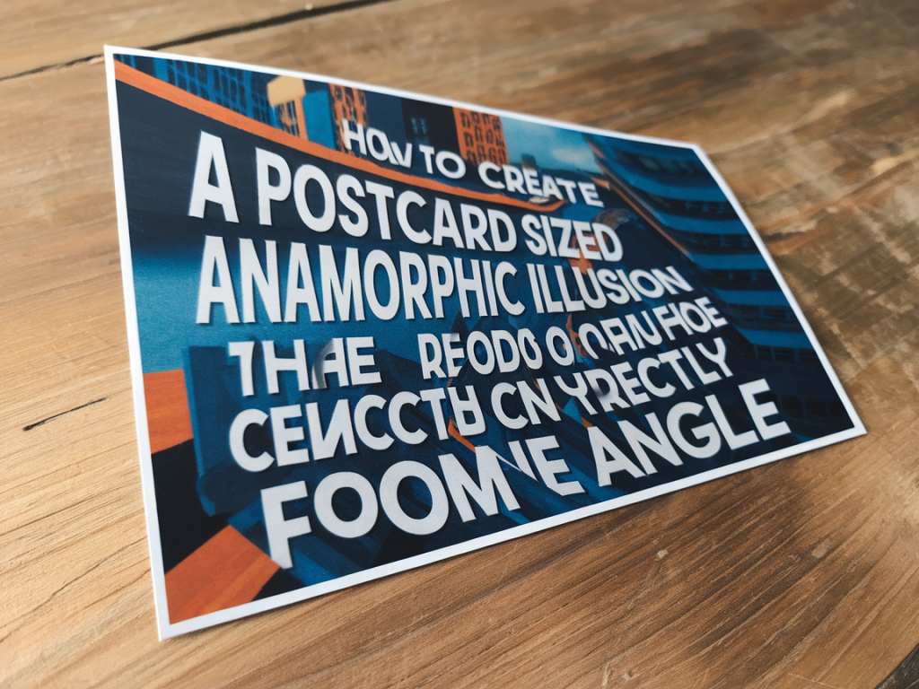
I first got hooked on anamorphic illusions when I saw a tiny warped drawing sit up straight only when viewed from a particular angle. There’s something quietly magical about a flattened image that resolves into readable text or a face when you move to the right spot. In this piece I’ll walk you through making a postcard-sized anamorphic illusion that reads correctly from one angle — a playful, pocketable project you can finish in an afternoon with simple tools.
What is anamorphosis and why postcard-size?
Anamorphosis is a deliberate distortion of an image so it looks normal only from a specific vantage point. The technique has roots in Renaissance art and street painting, but it’s also wonderfully suited to small-scale craft: a postcard-sized illusion fits into hands, slips into a wallet, and invites close inspection. It’s the kind of object that rewards curiosity — a tiny secret that only resolves when you tilt your head just so.
Materials and tools
Here’s what I usually gather for a postcard anamorph:
If you want to experiment, a small sheet of acrylic or plexiglass as a viewing plane is handy, but I usually just use my phone camera or a folded piece of card to mark the right angle.
| Material | Why I use it | Budget alternative |
|---|---|---|
| 300 gsm card | Solid base for crisp lines and handling | 200 gsm card or multiple layers of 160 gsm paper glued together |
| Tracing paper | Helps transfer and warp designs | Baking paper or thin scrap tracing paper |
| Fineliner pens | Clean outlines and small details | Pencil or gel pen |
Choosing a word or image
I recommend starting with a short word (3–7 letters) or a simple icon. Words like "HI", "SMILE", or initials work beautifully. The key is to design forms that can stretch without losing recognizability. Avoid extremely ornate typography on your first try. Sans-serif letters are forgiving and translate clearly once distorted.
Planning the viewpoint
Decide where you want the postcard to be read from. For a postcard-sized piece, I often choose a viewing point about 30–50 cm away and slightly to one side. You can mark this with a small object on your desk. If you’re making a gift, think about how the recipient will hold it — in my experience, people tend to hold postcards at chest height and slightly angled toward themselves.
Step-by-step process
Here’s how I make an anamorph that reads correctly from one angle. I prefer to work directly on paper for speed, but you can do the same digitally if you like.
Tips for a cleaner result
Troubleshooting common problems
Problem: The word reads, but looks stretched or illegible.
Problem: Letters appear too thin or disappear.
Problem: Colours muddy when viewed from the angle.
Variations and playful experiments
Once you’ve mastered a single-angle postcard, try these variations:
Sharing and gifting
My favourite thing about these postcards is giving them away. I often slide one into a letter or leave it on a friend’s desk with a note. If you post photos, show both the flat view and the viewing-angle shot — the before-and-after is what makes people stop scrolling. If you want to include a little how-to for the recipient, write a tiny arrow and the distance (e.g., “view from 40 cm to the right”) on the back.
If you’d like more step-by-step photos, templates, or a printable grid to help you get started, visit the project page on Max the Magician where I’ll add downloadable resources and a short video demo. I love seeing your versions, so tag me or send a photo — I’m always curious to see what others invent with this classic optical trick.