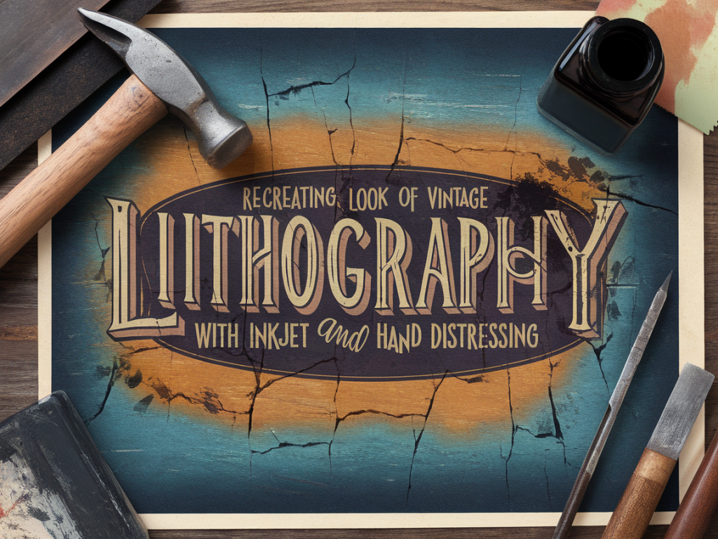
Recreating the look of vintage lithography with inkjet and hand distressing

Recreating the look of vintage lithography with inkjet and hand distressing

I’ve always been drawn to the slightly imperfect, inky warmth of vintage lithographs — the ghostly registration shifts, the subtle halftone screens, and the way colours sit on the paper like old memories. Recreating that look using a modern inkjet printer and a bit of hand distressing is one of my favourite studio exercises. It’s equal parts design, printcraft and playful abrasion, and it transforms digital images into tactile, timeworn objects that feel like they carry a story.

Why imitate lithography with inkjet?

True lithography is a beautiful but specialised process. Most of us don’t have access to a litho press, greasy stones or the skilled hands that make those prints sing. Recreating the aesthetic with an inkjet lets you get that vintage vibe in an accessible way — keep all the control of digital editing, and then add the tactile richness of hand finishing.

Plus, the tension between the crispness of a modern printer and the deliberate, analog imperfections we introduce by hand is where the magic happens. Your work will feel both contemporary and heirloom-worn — a lovely contradiction.

Materials I use

Item Why I use it
Inkjet printer (Pigment inks preferred) Reliable colour, good adhesion. Epson EcoTank or Canon PIXMA lines work well.
Matte or textured paper (200–300gsm) To mimic the tooth of litho paper. I like Somerset or Arches-style papers, but heavyweight textured matte inkjet papers are affordable.
Watercolour or acrylic inks (optional) For small hand-applied colour touches and drips.
Sandpaper (400–800 grit) & pumice For gentle abrasion and revealing paper fibres.
Rubber stamp ink + small brayer To add uneven spotty printing and faux plate marks.
Distress inks or watery acrylic wash Age the paper edges and produce subtle staining.
Masking fluid or frisket To protect areas when applying washes or sanding.

Preparing your artwork — design tips

If you want authenticity, start with design elements that read as print-era: limited colour palette, heavy outlines or simple halftone textures, and a slightly uneven registration between plates. I usually compose my artwork in Photoshop or Procreate and think about it as if I were planning separate colour plates.

  • Separate colours into individual layers — think in terms of three plates: base tone, mid-colour, and spot colour (a red or blue often reads as vintage).
  • Add subtle halftone or dot textures to large areas. In Photoshop, use Filter › Pixelate › Color Halftone or create a custom halftone pattern. Keep the dot size relatively large for a lo-fi feel.
  • Create slight offsets for layers to mimic registration mismatch. Duplicate a layer and nudge it 1–3 pixels horizontally or vertically for that charming misregistration.
  • Lower the opacity of some layers (70–90%) so colours look like they’re sitting on the paper rather than being saturated fills.
  • Printing: settings and paper choices

    Choose a matte paper with some tooth. Smooth glossy papers fight the illusion; the goal is a paper that soaks up ink like a sheet that’s been handled for decades.

  • Set your printer to the highest quality matte setting. If your printer offers a “photo black” vs “matte black” option, choose matte.
  • Use profiled ICC paper settings when possible — they’ll help keep colours predictable. For a more authentic, faded look, slightly desaturate in your file rather than fighting the printer colour profile.
  • Print on slightly heavier stock than you think you need; you’ll be sanding and rubbing, so sturdier paper holds up.
  • Hand distressing techniques

    Now for the fun, messy, tactile work. Take your printed sheet and experiment. I always test techniques on a spare print first.

    Edge wear and staining

  • Use a soft brush or a torn sponge to apply a thin wash of watered-down acrylic or distress ink around the edges. Let it pool subtly in the paper tooth to simulate age.
  • Lightly sand the corners and edges with 400–800 grit sandpaper. Work slowly: you want soft abrasion, not holes. Sand in small circular motions to reveal fibres and soften the printed pigment.
  • Faux plate marks and ghosting

  • Load a small brayer with a little rubber stamp ink (the kind used for block printing). Roll it lightly over areas where you want uneven ink density.
  • For ghost plate marks, print a second lighter pass but feed the paper in slightly askew, or place the printed sheet back into the printer and print a semi-transparent layer — set opacity to 30–40% in your file. This builds believable registration errors.
  • Halftone distressing

  • Gently scuff halftone areas with a soft toothbrush dipped in a diluted bleach solution (test first). The tiny dots will soften and break up, creating irregularities like those found on old mass-printed ephemera.
  • Alternatively, use an eraser to rub small areas of halftone to create missing dots and worn spots.
  • Adding hand-applied marks

    Some of the most convincing elements are small, human touches: brush strokes, ink bleeds, and tiny smudges.

  • Use a vintage dip pen or a fountain pen with slightly dilute ink to add incidental lines, signature marks or subtle cross-hatching.
  • Tap a loaded brush to make small speckles or misprinted stars — these give the surface an inconsistent density similar to antique prints.
  • Common problems and fixes

  • If colours look too saturated: reduce saturation in your file, or print on a thicker matte paper that absorbs more ink.
  • If sanded areas look like they’ve been sanded away too aggressively: gently reintroduce colour with a dry brushing of watered-down acrylic using a stiff flat brush.
  • If your printer jams with textured paper: feed single sheets manually and choose a heavier media setting in the printer driver.
  • Variations to try

  • Create a limited-edition look by using metallic or fluorescent spot colours in small areas and distressing over them so metallic flecks peep through.
  • Combine letterpress-style text (set in heavy woodtype or a slab serif) with your printed imagery; the contrast between crisp type and worn illustration reads very vintage.
  • Experiment with different washing solutions — tea stains give warm sepia tones, while diluted black acrylic yields cooler gray aging.
  • Documenting the process

    I always photograph stages as I go: the pristine print, the first nicks and scuffs, the halfway scrubbed sheets. Those images become part of the story I tell about the piece — they reinforce that the final object is a record of making, not just a reproduction of a style.

    This blend of digital control and manual decay is what keeps me returning to the technique. It’s forgiving, playful and full of surprises: sometimes the ugliest scuff turns into the sweetest feature. If you try it, send a picture — I love seeing other makers’ experiments and the tiny accidents that become deliberate design choices.

    You should also check the following news:

    DIY Projects

    A beginner's guide to making a disappearing ink effect with household materials

    02/12/2025

    I love little tricks that feel like small, domestic miracles: a message that appears and vanishes, an ink that fades like a ghost. Disappearing ink...

    Read more...
    A beginner's guide to making a disappearing ink effect with household materials
    Tutorials

    Turn a single sheet of paper into a pop-up scene in under 20 minutes

    02/12/2025

    I love small, quick projects that still feel like miniature acts of magic. This pop-up scene uses a single sheet of paper and can be made in under 20...

    Read more...
    Turn a single sheet of paper into a pop-up scene in under 20 minutes