I love the way a well-made prop can tell a story before anyone reads a single word. A sun-faded book cover, a box with flaking paint, or a faded poster edge can instantly place a scene in a different time. Over the years I've experimented with all kinds of ageing techniques for paper and cardboard — stains, inks, abrasion, and little mechanical tricks — and what I've learned is that convincing patina is often about restraint and layers rather than one dramatic effect. Below are the methods I use when I want paper or cardboard to look genuinely lived-in, with options for delicate antiques through to well-travelled, grimy ephemera.
Materials I reach for
Here’s a compact list of the tools and materials I commonly use. You don't need everything, but it's helpful to see the range so you can pick what suits your project.
| Paper/Cardboard | Watercolour paper, kraft card, book pages, cereal box board |
| Inks & Paints | India ink, walnut ink, diluted acrylics, acrylic washes |
| Stains & Dyes | Tea, coffee, diluted Rit dye, pigment washes |
| Dry Media | Graphite, charcoal, pastels, soft Conte crayons |
| Tools | Spray bottle, toothbrush, sponge, sanding block, craft knife |
| Fixatives & Finishes | Matte spray varnish, PVA glue, wax (beeswax or Renaissance Wax) |
Start with the right base
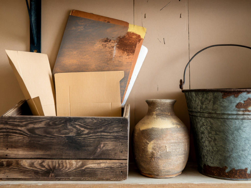
Choosing your base paper or board matters. Thin printer paper takes stains easily but can wrinkle and tear. Heavy watercolour paper can take water-based techniques without disintegrating and gives a lovely texture. For boxes and structural props, I use single- or double-wall cardboard depending on the strength needed; kraft board, with its natural brown tone, gives an immediate aged feel without much work.
When I want a convincing old book look, I often pull pages from an old paperback I can sacrifice, and for postcards or posters I use a smooth-ish paper so inks sit and feather in a believable way.
Layer stains — tea, coffee and walnut ink
Stains are the first, essential layer. They create that uneven, time-worn ground that all other effects sit on.
My favourite is tea staining because it's safe, accessible, and gives warm sepia tones. Brew a strong pot (think several bags or a small pot of loose leaf) and let it cool. For deeper colour, I use instant coffee dissolved in hot water. Apply with a sponge or large brush, and then tilt the paper to let drips form natural lines.
For darker, more neutral stains I reach for warm walnut ink. It’s intense and stains in a way that suggests smoke or long-term exposure. Apply walnut ink sparingly: dilute it and sponge on around the edges, leaving the centre lighter for a naturally handled look.
Distress with abrasion and water
Once the stains are in place and dry, I begin to sculpt the surface. Sandpaper or a sanding block is excellent on cardboard edges — rub the edges gently until the top layer starts to fray. For paper, I use the side of a craft knife to nibble and fold edges, then soften with a fingernail.
Water can create soft spots and buckling that reads as age. Lightly spray cold water with a fine mist and let the paper ripple. Dry it flat for subtle texture or scrunch and dry for stronger creases. If you want a brittle, sun-bleached effect, repeat cycles of wet and dry then gentle sanding on the peaks.
Add grime and fingerprints
Real objects accumulate oil and dirt where hands touch them. To simulate this without getting your prop truly dirty, use a combination of graphite, charcoal and washable pigments.
Remember: less is more. Human hands touch the edges, the centre is often cleaner.
Crackle, flaking and lifted layers
To suggest peeling varnish or flaking paint on cardboard props, PVA glue (white craft glue) is your friend. Apply a thin coat and let it dry slightly — while tacky, press on a thin paper patch and then peel it off. You'll be left with lifted fibers and a convincingly worn patch. For a more subtle crackle, brush on a layer of diluted PVA and then a thin acrylic wash over it; as it dries, the PVA can create tiny separation lines.
If you need obvious cracks, use a thin blade to score fine lines, then rub black or brown ink into them. Wipe the surface clean so the ink remains in the cracks only.
Faux foxing and water rings
Those tiny brown spots and water rings on old paper are called foxing. I make them with a toothbrush and a diluted mixture of iron(II) sulfate (used cautiously) or simply with more tea and a pinch of brown watercolour pigment.
Keep these details sparse. Overdoing foxing makes a page feel artificially "aged".
Ink fading and typographic aging
To age printed text, I use two approaches. For subtle fading, brush a thin glaze of diluted gesso or white acrylic over the text and then sand the raised areas gently. For more dramatic aging, print on thin paper, stain the sheet, then sand and crease the letters so ink rubs away naturally.
If you’re recreating a Victorian document, consider bleaching edges slightly with a weak sodium percarbonate solution — this lifts some tone but should be used with caution and protective gear.
Seal and protect
Once you're happy with the patina, fix the surface so the effects don't smudge in handling. I normally use a matte spray varnish (Krylon Matte works well) held at a distance to avoid puddling. For pieces that will be handled a lot, a thin coat of PVA diluted 1:1 with water can strengthen fragile paper; however, it will darken the tones slightly, so test first.
For an authentic soft sheen like an old leather-bound book, buff a tiny amount of beeswax or Renaissance Wax and polish it with a soft cloth. This also gives a tactile aged feel.
Troubleshooting common issues
If your paper has buckled and won’t flatten: press it between heavy books with a sheet of baking paper between layers. For stubborn curl, mist lightly and press again. If stains are too dark: lift them with a damp sponge, blotting rather than rubbing, and then let dry; repeat carefully. If your edges look too contrived: soften them with a pencil eraser and reintroduce tiny flecks of grime so the wear looks gradual.
Variations and creative ideas
Patina on paper and cardboard is about storytelling — each mark you add should answer the question "what happened to this object?" When you layer stains, abrasions and smudges thoughtfully, the result feels like an object with history rather than a prop that’s been "aged." I hope these techniques spark a few experiments in your studio. If you try something unusual, tell me about it — I love seeing new twists on old effects.