I love the challenge of telling a whole tiny story in a very small space — a single-minute sequence that still manages to surprise, amuse or linger. Over the years I’ve turned many of these micro-narratives into postcards: compact, tactile objects that can be mailed, pinned to a wall or slipped into a sketchbook. Below I’ll walk you through how I storyboard a one-minute visual story that fits on a postcard — from initial idea to printable panels — using simple tools and a few studio habits that keep the process playful.
Start with a single, clear idea
A one-minute story needs one driving idea. Pick a single beat you want the viewer to experience: a flip of mood, a small reveal, a simple gag, a quiet transformation. Don’t try to squeeze in subplots. My favourite prompts are objects behaving oddly (a teacup that levitates), a tiny character facing a constraint (a mouse trying to reach a bell), or a visual pun that can be revealed in the last frame.
Write that idea down in one sentence. If you can’t, you haven’t distilled it enough. Example: “A paper bird learns to fly off a postcard.” That sentence becomes your north star as you make choices about framing, timing and the final reveal.
Think in beats, not pages
Time is your main constraint. A 60-second story can be divided into roughly 12–18 visual beats if you want each beat to land with clarity (around 3–5 seconds each). For a postcard, you’ll often compress those beats into a small grid or a single unfolding image.
Here’s a simple beat breakdown I use for a 60-second postcard story:
- Opening frame: establish the subject and setting (3–5s)
- Inciting detail: a small action that promises something (3–5s)
- Rising action: 3–6 quick beats showing effort or change (3–4s each)
- Turning point: the unexpected complication or reveal (4–6s)
- Resolution: a clear, satisfying last image (4–6s)
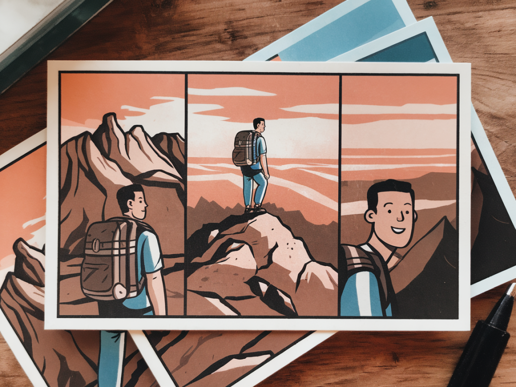
For a postcard layout I usually aim for 9 panels (3x3 grid) or a single strip of 6 panels across the back. These formats map nicely to 12–15 beats by combining very short beats into single panels when necessary.
Choose a postcard format
Common postcard sizes:
| US | 4" x 6" (102 x 152 mm) |
| UK / ISO A | A6 (105 x 148 mm) |
I usually work on A6 for European mail and because it’s a comfortable scale for drawing by hand. If you plan to print on a commercial service (like Moo, Vistaprint, or a local printer), check their bleed and safe-area specs. Typically I leave a 3–5 mm margin for safety and add a 3 mm bleed if the image goes to the edge.
Thumbnail the storyboard
Now sketch thumbnails — tiny, rough, fast. I use a small Moleskine cahier and a mechanical pencil (0.5 mm) or a Staedtler HB. The goal is speed and clarity, not prettiness. Draw the postcard outline and divide it into the panel layout you chose (3x3, strip, or a single image divided by implied gutters).
For each thumbnail panel, note:
- Primary action (what happens)
- Framing (wide, medium, close)
- Movement direction (left-to-right or right-to-left)
- Timing in seconds or beats
Beware of visual clutter. On such a small canvas, silhouettes and clear shapes matter more than detail. I often block in characters with simple tones so I can read the read-the-image flow at a glance.
Plan motion and transitions
Think about how the eye travels across the postcard. Western readers will scan left-to-right, top-to-bottom, so design the action to guide that journey. Use arrows or faint pencil marks to indicate motion paths during the thumbnail stage.
Transitions are where the magic happens in a micro-story. Consider these simple techniques:
- Match cut: continue action across panels (a hand reaching in panel 2 becomes a door handle in panel 3).
- Graphic wipe: use a shape (a bird wing or a shadow) to bridge two panels.
- Zoom: move from a wide establishing shot to a close-up to heighten focus.
- Stutter frames: repeat a slight change across 2–3 panels to imply time passing quickly.
Write the mini-script
Even a postcard benefits from a short accompanying script — two to five words per panel is plenty if you want captioning. I prefer to keep most of the story visual and use text sparingly as a punchline or to add voice. Example script notes for the paper bird idea:
- Panel 1: “A folded bird sits on a windowsill.”
- Panel 4: “A gust — it flutters.”
- Panel 7: “It learns to catch the wind.”
- Panel 9: “It flies out, postcard empty.”
If you plan to animate the postcard for a social media loop, write down frame durations (e.g., panel 1 = 4s, panel 2 = 2s, panel 3 = 3s). This informs how much visual complexity each panel needs.
Refine and test legibility
Reduce. In small formats, less is more. Eliminate background noise, simplify patterns, increase contrast between foreground and background. Print a low-resolution mockup at actual postcard size on regular paper — this is my favourite test. If the main action reads at arm’s length, you’re good.
Check typography: choose a clear typeface (I like Futura or a clean humanist sans) and keep lettering above 6–7 pt for legibility once printed. If you hand-letter, use a fine liner or brush pen with consistent stroke weight.
Make the art — low-tech or hybrid
For the final artwork, pick a method that matches your time and style:
- Hand-drawn: ink with a Micron or Pentel brush pen, then scan at 300–600 dpi.
- Mixed media: collage small painted papers or stamped textures; scan and arrange digitally.
- Digital: draw in Procreate or Photoshop at 300 dpi, set to postcard dimensions with bleed.
I love hybrid workflows: paint a few textures with gouache, scan them, and combine with vector lettering in Affinity Designer. This gives warmth and keeps the final file clean for print services.
Prepare print files
Export as a CMYK or RGB file according to your printer’s requirements. Include bleed if needed and keep a safe zone of at least 3–5 mm from the edge for important elements. Save a high-resolution PDF for print and a compressed JPG/PNG for web sharing.
If you’re printing at home, use 300 gsm cardstock for a postcard feel. For a glossy finish, choose coated stock; for a more tactile, handmade vibe, choose uncoated or a textured stock like Munken paper. I sometimes order small runs from Moo for heavier paper and great colours.
Extra tips from my studio
- Always keep a stack of A6 test prints — they become a quick gallery on my pinboard and help with pacing decisions.
- Limit your palette to 2–4 colours for clarity and printing economy.
- If you want to mail the story, remember postal writing space — either put the panels on one side and postage/address on the other, or offer a fold-out option.
- Make a short looped animation of the panels (GIF or MP4) for Instagram — it’s a great way to test timing before you print.
Storyboarding a one-minute postcard is a delightful constraint: it forces decisive visual choices, encourages playful economy and rewards the joy of tactile making. Keep the beats simple, the imagery bold, and don’t be afraid to let an awkward thumbnail lead you to an unexpected solution — often the best tricks are stumbled upon while sketching fast.