I love telling very small stories that do double duty: they charm the viewer and quietly teach a making technique. A three-panel visual fable is perfect for that. It’s short enough to keep a single, satisfying narrative beat but long enough to show a process — a single craft gesture, a material trick or a simple sequence of steps. Below I’ll share how I design these pieces, from the seed of an idea to thumbnail sketches, visual pacing and the ways to fold instruction into story without losing the whimsy.
Why three panels?
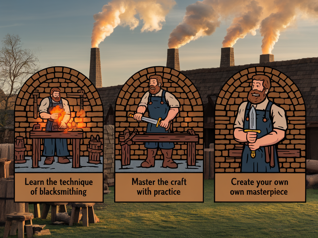
Three panels feel almost magical in their economy. There’s an implied rhythm — setup, complication, payoff — familiar from jokes and classic fables. For teaching, that rhythm maps well onto observe, attempt, result. I use the first panel to introduce mood/character and the material or tool; the second to show the challenge or the key action; and the third to show the resolved trick plus the small lesson. The viewer learns by watching a narrative unfold rather than by reading a dry list of steps.
Finding your small fable
Start with a tiny premise that relates to a specific technique. Questions you might ask yourself:
- What single gesture or step do I want someone to remember?
- Can that gesture be embodied by a character or object?
- What small emotional arc will make the teaching memorable?
Example seeds: “a squirrel learns to tie ribbon with a loop-and-pull knot,” “a child discovers how to blend watercolour washes,” or “a clockmaker fixes a stuck gear with a simple shim.” I often keep a list in my sketchbook titled “tiny moral + craft,” where I pair a lesson with a technique. That pairing is the heart of the fable.
Plan the beats — what each panel must do
Once you have a premise, define the three beats. I draw thumbnails the size of a postage stamp, three boxes across the page. Each thumbnail gets one line note: what happens, what’s the visual focus, and what tactile detail do I need to show?
- Panel 1 — Setup: Introduce character/object and the material. Keep the composition simple and the palette limited. This is where you name the technique subtly: show the brush, the knot, the tool.
- Panel 2 — Action/Problem: Show the key action or the problem that requires the technique. Zoom in if the technique is fiddly — close-ups are powerful here.
- Panel 3 — Payoff/Lesson: Reveal the result, ideally with a small twist — humor, wonder, or a visual pun — and a clear visual of the finished technique.
Choosing viewpoint, scale and detail
Decide early whether your panels are a consistent viewpoint or whether you’ll shift perspective to emphasize the technique. My rule of thumb: maintain enough continuity so the three images read as a sequence, but don’t be afraid to jump in for a close-up in panel two if that’s where the craft action happens.
Scale matters. If you want to teach a stitch or a paper-fold, make panel two larger relative to the others in your layout or use a close-up crop that fills the panel. Keep background elements minimal to avoid distracting from the hand, tool or material.
Visual language for instruction
Visual cues replace text in a three-panel fable. Use arrows, motion lines, small inset diagrams or contrast of color to highlight the exact motion. I often combine:
- Sequence arrows that show the path of a thread or the rotation of a tool.
- Numbered micro-steps in panel two if the action really needs two small sub-steps — but keep the numbers unobtrusive.
- Contrast: a bright accent color on the material or the point of contact while the rest of the panel is muted.
Text can appear sparingly: a single word in panel one (“oh!”), a short imperative in panel two (“twist”), and a soft reflection in panel three (“there — fixed”). Those words can give voice without turning the piece into a tutorial leaflet.
Materials, technique and readability
When your goal is to teach, you must make the technique legible at the final display size. Test a thumbnail at the size it will be seen: on social media, a blog sidebar or a printed zine. If the critical detail disappears, simplify the drawing or use a magnified inset.
Here’s a simple table I use while planning to keep readability in focus:
| Panel | Critical detail | Visibility test |
|---|---|---|
| 1 | Tool + hand placement | Thumb-size legible? |
| 2 | Motion path / interaction | Can you understand motion without text? |
| 3 | Result / finish | Is result recognisable at small scale? |
Composing for emotion and narrative
A visual fable succeeds because the viewer cares — even a little — about the character or object. Use body language and facial expression (even in simple shapes) to convey curiosity, frustration and delight. I like to anthropomorphise objects just enough: a teapot that looks puzzled, a spool of thread that looks proud. That tiny bit of personality makes the craft lesson feel alive.
Tools and media I reach for
I work both analog and digital. For quick experiments I draw with a mechanical pencil and a black fineliner (Sakura Pigma Micron is a favourite). For adding emphasis I use gouache for its flat, expressive color, or a digital layer in Procreate to tweak contrast and add arrows. If you plan to animate the panels later, keep layers separate in your digital file so the motion lines, hands and objects can be isolated.
Common questions and practical tips
- How much text should I include? Keep it minimal. One short caption or a single-word exclamation per panel is usually enough. Let the drawing do the work.
- What if the technique is complex? Reduce it to a single memorable gesture for the fable and link to a longer tutorial (on maxthemagician.co.uk, for example) for full steps and materials.
- How to test the teaching? Show your three-panel to a friend who knows nothing about the technique. If they can replicate the gesture or explain it back to you, you’re close.
- Size and format? Design for the place it will live. Instagram prefers square; a blog column needs a narrow vertical. Make sure the important detail remains legible in the final format.
Examples of micro-structures you can try
- “Discover + Try + Delight”: A character finds an old brad, uses a paper hinge technique in panel two, and the toy bird flies in panel three.
- “Problem + Technique + Reuse”: A torn page (problem), a simple paper mending stitch (technique), then the mended page becomes a pocket for a secret note (reuse).
- “Misdirection + Reveal + Lesson”: You think they’re gluing, but panel two shows a clever folding step; panel three reveals a seamless join — lesson: fold before you glue.
When I make a three-panel visual fable, I keep it playful and modest. The technique doesn’t need to be world-changing — it simply needs to be shown clearly and wrapped in a small slice of story. These tiny narratives stick with people; they teach without lecturing and invite the viewer to try the gesture themselves. If you make one, I’d love to see it — tag me or drop a link at maxthemagician.co.uk so we can share a little wonder together.