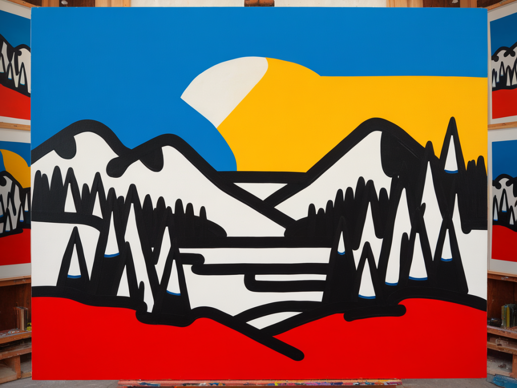
I love making small paintings that feel expansive — pieces that, at arm’s length, glow with the same presence you’d expect from a larger canvas. There’s a little sleight-of-hand to it: you don’t need more surface area to create depth, light and drama. You need a few deliberate color-mixing strategies that read big. Below are three tricks I return to again and again. Each is practical, tactile and forgiving — and all of them work whether you’re working in gouache, acrylic, oil or watercolor.
Use a limited, skewed palette (and let contrast do the heavy lifting)
When I sit down to a small format — postcard-sized paintings or a tiny toy portrait — my first step is to restrict the number of pigments I use. Limiting choice forces stronger decisions and creates a visual coherence that reads as “big” because the eye isn’t distracted by competing hues.
My usual approach: pick a warm base, a cool base and a dark. For example, a warm yellow (Cadmium Lemon or Hansa Yellow), a cool blue (Ultramarine or Phthalo Blue) and a deep neutral (Burnt Umber or a mix of Alizarin Crimson + Indanthrone Blue). If I’m working in acrylic I’ll often use a transparent tint like Quinacridone Rose to adjust chroma without muddying the mix — Golden and Winsor & Newton both make lovely transparent series.
Practical steps:
The benefit of this trick is two-fold: limited palettes read more unified (so the painting feels mature and scaled-up) and the value contrasts you create with those mixes feel intentional rather than accidental.
Push subtle temperature shifts to imply scale and light
Large paintings often feel “big” because they articulate light across space — warm lights, cool shadows, mid-tone atmospheres. On small work you can simulate that sense of airy, architectural light by being precise with temperature shifts.
What I mean by “subtle” is important: you don’t need saturated oranges or neon blues. Tiny tweaks in temperature will read as major shifts when your painting is small. I’ll warm a shadow edge by adding a tiny amount of Yellow Ochre or warm Quinacridone to the mix, or cool a sunlit surface with a whisper of Phthalo Blue mixed into my white. The trick is to keep the adjustments minimal so the overall color still belongs to your limited palette.
How to practice this:
An aside on materials: in watercolor I rely on separation and glazing to achieve the same results; in oils I can push temperature more aggressively because I have more working time. But the underlying visual logic is identical: small color temperature differences suggest large-scale light.
Use optical mixing and glazes for layered complexity
When I want a small piece to breathe like a big one, I avoid painting everything solidly in one pass. Instead I build color by layering — either with tiny strokes/stippling for optical mixing, or with thin glaze layers to create depth and translucency.
Optical mixing is sewing colors next to or over each other so the viewer’s eye blends them at a distance. This is especially powerful in small work because the viewer’s eye does that blending automatically. You can get luminous greens with a wayward dot of warm yellow next to a cool blue; the mix happens optically without muddying the pigment on your palette.
Glazes, on the other hand, are transparent layers that shift hue and value without obscuring the detail beneath. I use glazing to modify tones, unify an area, or push an atmospheric cast. In acrylics, I’ll mix a transparent color with a glazing medium (like Golden’s Fluid Glazing Medium) so it dries clear and even. In oils I thin with a little linseed or a dedicated glazing medium.
Quick recipe for a glaze wash that adds scale:
| Purpose | Thin glaze mix | Application |
| Warm afternoon cast | Transparent Yellow Ochre + medium | One thin wash over highlights and mid-tones |
| Cool distance | Ultramarine + transparent medium | Thin veil in shadowed planes and receding areas |
| Rich vignette | Burnt Umber + glazing medium | Edge glaze to focus centre |
When glazing, remember to let layers dry between passes. The slow build-up of luminous color is what makes a small painting feel as though light has depth — the same reason sunsets look vast: many layers of subtly different color.
Extra practical tips that tie the three tricks together
These three tricks — a restricted but purposeful palette, delicate temperature shifts, and layered optical color — are what I reach for when I want small work to feel big. They’re easy to practice in thumbnails and forgiving in execution. Try them in a tiny 4x6 study next time you have a spare hour; you might be surprised how much presence a few well-mixed slivers of color can create.
